
 By
By Robert Richardson is one of modern cinema’s most distinctive visual stylists – a cinematographer whose signature look is instantly recognisable yet endlessly adaptable. Over a career spanning four decades, he has worked with some of the most celebrated directors of our time, including Oliver Stone, Martin Scorsese, and Quentin Tarantino, earning three Academy Awards for Best Cinematography along the way. Known for his bold contrasts, dazzling highlights, and painterly manipulation of colour and texture, Richardson’s images don’t simply capture a story – they shape how we experience it.
Our selection of his greatest works highlights both his technical mastery and his willingness to experiment. Early films such as City of Hope reveal the emergence of his hallmark “halo effect,” while Born on the Fourth of July shows his innovative use of anamorphic framing and varied film stocks to evoke shifting moods. Collaborations with Scorsese (Casino, Bringing Out the Dead, Shutter Island) display his ability to merge gritty realism with stylised flourish, and his partnerships with Tarantino (Kill Bill, Inglourious Basterds) underline his gift for genre homage. Together, these films showcase a cinematographer who continually reinvents the visual language of cinema.
First the honourable mentions…
City Of Hope
Dir. John Sayles (1991)

This urban melodrama – in which writer-director-actor John Sayles embraces a slew of social issues in what is essentially an ensemble piece – is the only entry here not directed by Oliver Stone, Martin Scorsese or Quentin Tarantino.
Yet it is worth mentioning given it not only showcases some of Richardson’s early stylistic touches (especially the much-copied “hot corona–rim effect” involving the use of bright overhead lights to create halos around his camera’s subjects*) but proves that dialogue-heavy movies rely just as much on look and mood as they do on performance.
It was Richardson’s second job as director of photography (DOP) for Sayles after their collaboration on 1988’s baseball saga Eight Men Out.
Born On The Fourth Of July
Dir. Oliver Stone (1989)

After shooting seven feature films – four with Stone – this was the first time the DOP employed the anamorphic format (Panavision). “I think it is the perfect frame for a theatrical feature,” he told American Cinematographer’s Bob Fisher in the magazine’s February 1990 edition. “I felt the anamorphic format would push us out and keep us away from focusing solely on a central figure.”
He also used a number of Eastman film stocks to enhance the different visual moods created for each scene – a strategy he has continued with in his subsequent films.

Additionally, Richardson had to deal with a lot of camera movement, with 50% of the movie’s footage shot using a Steadicam. One result is a surreal Vietnam War sequence (filmed in the Philippines) unlike any other produced by Hollywood before or since.
This work brought him his second Best Cinematography Academy Award nomination (his first was for Stone’s Platoon in 1986).
10. Casino
Dir. Martin Scorsese (1995)
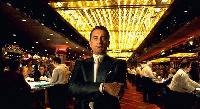
It must have been quite daunting for Richardson to follow in the footsteps of fellow lighting cameraman Michael Ballhaus, who helped define the distinctive look of Scorsese’s 1989 seminal gangster opus Goodfellas, a film which in many ways is a companion piece to this movie.

Crane shots, zooms, dollies, speed changes, perfectly-choreographed extended single takes – all of these stylistic touches make an appearance at some point in Casino’s visual narrative. On top of this, he had to light the inside of a ritzy Las Vegas gambling palace, where the landscape is dominated by human clutter and constant movement.

This was the first joint effort between the director and the DOP. After the shoot Richardson told American Cinematographer’s Stephen Pizzello: “Quite simply Martin is one of the most brilliant minds I’ve ever encountered. I think I could go to extraordinary places if we continued to work together. I felt we were very much in sync. But Martin has a very long relationship with (Ballhaus) and I’m sure they will continue that relationship in the future.”
Since then the pair would go on to work on four feature films (three of which are mentioned below) before the DOP’s death in 2017, with two of these collecting the Best Cinematography Oscar. In addition, Richardson has shot two documentaries for the director.
Discover More: Top 10 Robert De Niro Films
9. Bringing Out The Dead
Dir. Martin Scorsese (1999)
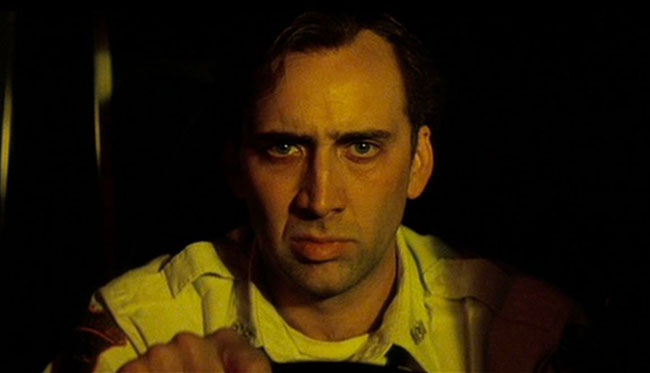
To embellish late night Manhattan with a ghostly feel – and give something of a visual nod to the spirit of noir – Richardson and Scorsese used skip bleaching, a process that involves, according to American Cinematographer’s Eric Rudolph, “an either partial or total elimination of the bleach step in printing, which results in the retention of more silver in the image, creating de-saturated colours and deeper blacks.”
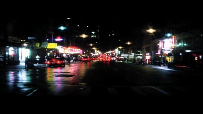
As the DOP noted: “Part of the point of the bleach-bypass was to overwhelm the red and yellow tones, which tend to predominate from signs in Manhattan at night. We were trying to move the whole film to a cooler black and white feel.”
Another interesting aspect of the cameraman’s approach was the fact a “more aggressive visual quality” was used each time the lead character, graveyard shift ambulance driver/medic Frank Pierce (Nicolas Cage), changed partners (John Goodman, Ving Rhames and Tom Sizemore).
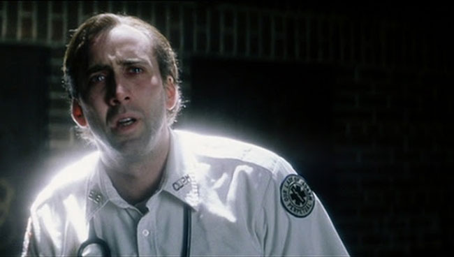
“As Nic’s character proceeds through his story, our lighting and camera angles become more extreme,” the cinematographer explained. This was the second Richardson/Scorsese outing.
8. Kill Bill – Parts I & II
Dir. Quentin Tarantino (2003 & 2004)

Following the completion of a colour/black and white project large enough to yield two motion pictures, Richardson told American Cinematographer’s John Pavlus his first union with Tarantino resulted in “the purest rhythm I have had with a director – ever.”
It also showed that the DOP, like his director, understood the fundamentals of genre, be it the Western, melodrama, thriller or horror. “What I’m going after … is what the genre represents; the attitude toward the film-making, rather than the film-making itself,” he said.
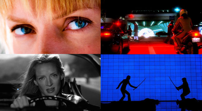
Examples of various lighting approaches and their results used by Robert Richardson to bring Quentin Tarantino’s vision to life.
Another distinctive technique Richardson had been honing for several years, and which appears in this work, was the “psychological” use of dimming cues within shots: “It might be in the slow fading-down of a background, or cross-fading between two different colours.”
Discover More: Top 10 Times A Table Became An Additional Character In A Quentin Tarantino Film
7. Inglourious Basterds
Dir. Quentin Tarantino (2009)

There’s nothing inglorious about the look of this allegorical bastardisation of history. Not only is this one of the most inventively bogus World War II movies ever made, but it’s a visual treat – and definitive proof that whatever one might think of the man, Tarantino has a pretty good handle on composition.
If anything, this film is another example of the above-mentioned attitude towards genre. This was Richardson’s second film with the director and the fifth for which he received an Academy Award nomination. Their two subsequent collaborations (2012’s Django Unchained and The Hateful Eight in 2015) also saw the DOP nominated for the Best Cinematography Oscar.
Discover More: Top 10 Films Of Oliver Stone
6. Shutter Island
Dir. Martin Scorsese (2010)

Strip bleaching was again used – this time in the form of ENR, a proprietary Technicolour process originally developed for Italian cinematographer Vittorio Storaro by some guys in Rome.
“ENR provides an apparent desaturation of skin tones and heightened grain, which enhanced the contrast with the Kodachrome look,” American Cinematographer’s Patricia Thomson explained.
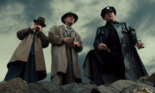
As a result the film’s colour palette alternates between a slightly desaturated look, used for the present day, and the saturated look of 1950s-era Kodachrome, utilised mainly for US Marshall Teddy Daniels’ (Leonardo DiCaprio) memories and hallucinations.
This latter Kodachrome aesthetic was a reference to George Stephens’ colour 16mm footage of the liberation of Dachau towards the end of World War II.

Aside from a subtle application of ENR, the movie’s palette was also achieved using a LUT – a dedicated high powered graphics processor that was slipped into the projector during the colour correction process (and thus used as a digital filter).
In terms of Richardson’s approach to the drama, the DOP said: “The lighting, colour and texture all contribute to the blurring of reality and hallucination, raising the question of what is subjective versus objective.” The results are stunning in what is Richardson’s and Scorsese’ fourth feature film.
5. The Doors
Dir. Oliver Stone (1991)

If anything this was the movie which saw the Richardson/Stone partnership (their sixth film together) shift into high gear, bridging the gap between their conventional output (which culminated in 1988’s Talk Radio) and the experimental chaos that followed with the arrival of JFK (also 1991 – see below).
Although The Doors has its detractors, there’s no denying it will survive as one of modern Hollywood’s great period pieces/costume melodramas, with the DOP’s lighting perfectly complementing the costume, production, set and art designs (of Marlene Stewart, Barbara Ling, Cricket Rowland and Larry Fulton respectively) to create an idealised version of America in the second half of the Sixties when the psyche of its spoilt youth culture was invaded by rock music, a growing media influence and psychedelic drugs.
Discover More:
16 Stunningly Photographed American Films That Were Completely Snubbed By The Academy Awards
4. JFK
Dir. Oliver Stone (1991)

For the recreation of the assassination of US President John F Kennedy in Dallas’ Dealey Plaza on November 22, 1963, Richardson duplicated the (predominantly black and white) existing 16mm news film – as well as Abraham Zapruder’s famous Super 8mm colour footage – on 35mm, 16mm and Super 8.
According to American Cinematographer’s Fisher, a total of seven cameras and 14 film stocks were used, producing 70-80 35mm black and white and “hundreds” of 16mm shots.
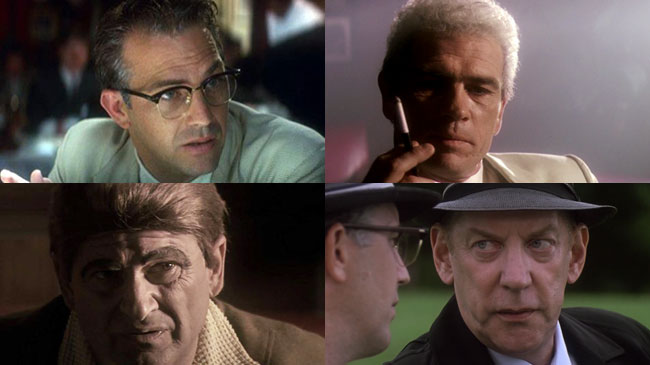
In his diary, the DOP noted “nothing should be more than one generation removed from the original material shot by the news media”. As for the mixed gauges spliced throughout the rest of the movie, which took all of the lighting tricks used in The Doors to the next level, Richardson predicted it would be “jarring”.
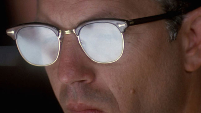
“That’s our intention,” he wrote. “You feel like you are being thrown into a memory. Hopefully, there will be some syntactical relationship, and the audience will recognise what Oliver is intending to be the principal truth of the story. That will require them to connect different visual elements.” This outing, which followed hot on the heels of The Doors, yielded Richardson his first Oscar.
3. Natural Born Killers
Dir. Oliver Stone (1994)

By his own admission this was a difficult shoot for Richardson, who had an “intensively negative reaction” to the script (which, coincidently, was based on an original idea by Tarantino).
“The story brought up unpleasant memories from my own childhood, and those memories plagued me to such a degree that my nights were literally sleepless,” he told American Cinematographer’s Pizzello.
“A tremendous number of demons came up through my body during the shoot; this picture almost resulted in a divorce with my wife (who, at the time, came close to dying from a serious illness), and it was ultimately the reason I moved out of Los Angeles.”

To create what Pizzello calls “garish, eye-popping psychological mindscapes”, Oliver Stone and his DOP (who were working together on their ninth movie) used a variety of shooting formats, including colour and black and white 35mm, 16mm, Super 8, Hi 8 and Beta.
Also thrown into this visual mix was stock footage, front- and rear-projections, touches of heavy metal animation as well as snippets from other movies.
This was all enhanced by a “hallucinatory brew” of offbeat lighting schemes, unusual angles and subjective camera techniques. At least 12 film stocks across all gauges were employed for the shoot.
2. The Aviator
Dir. Martin Scorsese (2004)
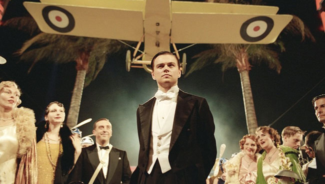
Apparently quite a bit of thought went into the look of this movie, which marked the third joint effort between Richardson and Scorsese and garnered the DOP his second Best Cinematography Oscar.
In his article “High Life”, John Pavlus points out that the film fused period lighting techniques, employed extensive effects sequences and digitally recreated two extinct colour processes – two- and three-colour Technicolour. This involved combined filtration and dyeing to create coloured release prints from a “matrix” of two or three strips of black and white negative.
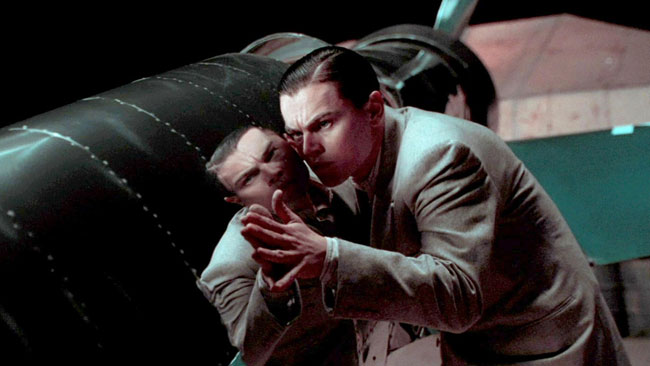
As Technicolour was being extensively used in Hollywood during millionaire Howard Hughes’ movie making career, Scorsese wanted these colour signatures to be part of the film’s design. This involved the use of various film stocks (six) to create and control visual texture.
“Prior to my involvement, Marty designed a colour timeline that influenced every creative department,” Richardson said. “He wanted the progression from a two-colour Technicolour palette to a three-strip palette to approximate the technological advances of the film industry at the time, but more importantly he felt it would mirror the character’s emotional evolution.” Wow!
1. Nixon
Dir. Oliver Stone (1996)

Like JFK, Richardson was instrumental in helping Stone create what American Cinematographer’s Ric Gentry aptly called a “jigsaw visual fabric” in yet another movie about 20th Century US politics.
To collect his vast array of shots the DOP used 35mm Panavision anamorphic lenses, 16mm Arriflex and Zeiss lenses, Sony Hi8 video, Betacam as well as a 1970s model Ikegami.
Unlike JFK, though, there were fewer handheld shots (or fewer kinetic camera movements) due to the daily number of set ups (25-30) over the 61-day shoot. Aside from economy, Richardson said this approach helped inject “a kind of stateliness” into the narrative.

One notable trick employed in the movie that Gentry highlights is the use of bounced light from reflective objects like glass coffee tables to illuminate the characters from below (this was also utilised quite effectively in JFK).
Although both Nixon and Casino were released around the same time, neither received an Academy Award nomination for their cinematography. Talk about oversight. At the time of writing, this was the 10th – and second last – teaming of Richardson and Stone, with their final effort together being the less ambitious (but nevertheless quite interesting) pulp thriller U Turn in 1998.
FOOTNOTE
*A term used by Ric Gentry in his article on Nixon.
Discover More
16 Stunningly Photographed American Films That Were Completely Snubbed By The Academy Awards

The Academy Award nominations for Best Cinematography don’t always reflect the best work of Hollywood’s most visually astute professionals.









Fascinating list Mark and an ideal way to shed light on an “unsung hero” of cinema’s exemplary work. Of course, you go where the work is and who would argue with the credentials of the directors on Robertson’s CV but I don’t think he could have picked three more unique filmmaking personalities. I’m sure there were a number of challenges in producing the work he did for three (and arguably four) visionaries.
If I was to pick a favourite, I’d throw Bringing Out The Dead out there for discussion. New York at night, damp streets, contrasting street illumination and black tarmac – some of the film looks absolutely glorious in an urban jungle sort of way. Contrast that with the range of colours styling Kill Bill or the glitzy presentation of Casino.
A clearly very talented DoP.
I didn’t know who Robert Richardson was before reading this but of course I know his work. What a brilliant selection of films. Surely there can’t be many cinematographers with such a great body of work?
Like Dan said above, I love the look of Bringing Out The Dead but there’s a nice balance of subtle work and more stylistic stuff.
Great list Mark.
As already has been said what an amazing body of work with some visionary directors. Robert Richardson isn’t a well known name but this list proves he should be for any film fan.
My personal favourite is Natural Born Killers as the visual aesthetic is so unique and the behind the scenes difficulties adds that extra layer of commitment to his art.
Great list. I also did not know who he was prior to reading this. Terrific insight.
Wonderful to see such a talented guy get the plaudits he so clearly deserves. My favourite example of his work from the list above would be Shutter Island. I love the look of that movie. Probably say the same thing about Natural Born Killers even though that film isn’t one I’m particularly fond of.